Chapter 2 Mapping with R
Many datasets contains informations about location. It is natural to use map to visualize these data. We can differentiate two kind of maps:
- static map: to be exported in pdf or png format, usefull to publish report;
- dynamic or interactive map: to be exported in html format for instance. We can visualize these maps in a web browser and add informations when we click on the map.
Many R packages exist for mapping. In this chapter, we present ggmap and sf for static map and leaflet for dynamic map.
2.1 ggmap package
We show in this part how to get background map and add informations from a dataset with ggmap package. For more details, we refer to this article
It is quite easy to download background map, for instance
library(ggmap)
us <- c(left = -125, bottom = 25.75, right = -67, top = 49)
map <- get_stamenmap(us, zoom = 5, maptype = "toner-lite")
ggmap(map)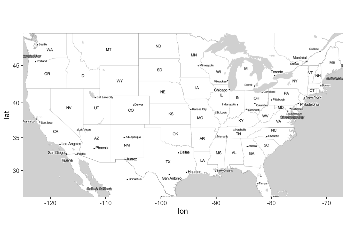
For Europe we can use
europe <- c(left = -12, bottom = 35, right = 30, top = 63)
get_stamenmap(europe, zoom = 5,"toner-lite") |> ggmap()
We can change the type of the background map
get_stamenmap(europe, zoom = 5,"toner-background") |> ggmap()
Here is an example for France
fr <- c(left = -6, bottom = 41, right = 10, top = 52)
get_stamenmap(fr, zoom = 5,"toner-lite") |> ggmap()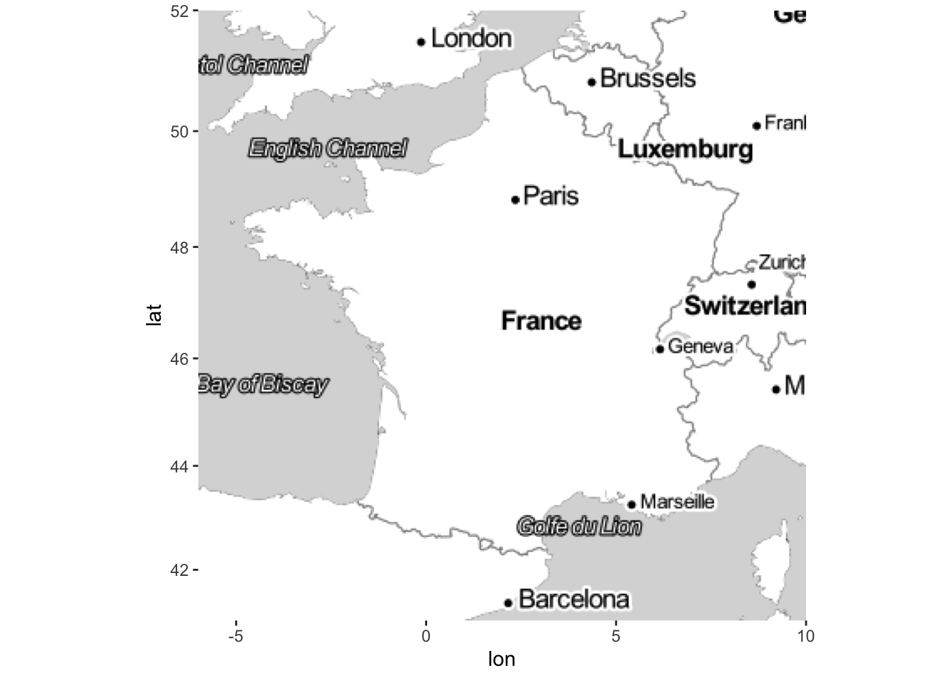
geocode function from ggmap made it possible to get latitudes and longitudes from a location. An API is now needed to use it (we could have to pay). We propose to use the following function instead:
if (!(require(jsonlite))) install.packages("jsonlite")
mygeocode <- function(adresses){
# adresses est un vecteur contenant toutes les adresses sous forme de chaine de caracteres
  nominatim_osm <- function(address = NULL){
    ## details: http://wiki.openstreetmap.org/wiki/Nominatim
    ## fonction nominatim_osm proposée par D.Kisler
    if(suppressWarnings(is.null(address)))  return(data.frame())
    tryCatch(
      d <- jsonlite::fromJSON(
        gsub('\\@addr\\@', gsub('\\s+', '\\%20', address),
             'http://nominatim.openstreetmap.org/search/@addr@?format=json&addressdetails=0&limit=1')
      ), error = function(c) return(data.frame())
    )
    if(length(d) == 0) return(data.frame())
    return(c(as.numeric(d$lon), as.numeric(d$lat)))
  }
  tableau <- t(sapply(adresses,nominatim_osm))
  colnames(tableau) <- c("lon","lat")
  return(tableau)
}
We can get latitudes and longitudes with
mygeocode("the white house")
                      lon     lat
the white house -77.03655 38.8977
mygeocode("Paris")
           lon      lat
Paris 2.320041 48.85889
mygeocode("Rennes")
            lon      lat
Rennes -1.68002 48.11134
Exercise 2.1 (Population sizes in France) The goal is to visualize some French cities.
Find latitudes and longitudes for Paris, Lyon and Marseille and represent these cities on a map (you can use a dot).
File villes_fr.csv contains population sizes for 30 cities in France. Visualize these cities by adding points in the previous map. We will use different point sizes in term of populations sizes in 2014.
2.2 Maps with contours, shapefile format
ggmpap makes it easy to download background map and to add informations with ggplot functions. However, it is more difficult to take into account of contours (boundaries for countries or department…). We propose here an introduction to the sf package. It allows to create “advanced” maps, by managing boundaries through specific objects. Moreover we can manage many coordinate systmes with this package. Recall that earth is not flat… But we usually visualize a map in 2D. We thus have to make projections in order to visualize locations defined by a coordinate (latitude and longitude for instance). These projections are generally managed by the packages, it is the case of sf. We can find documentation on this package at:
- https://statnmap.com/fr/2018-07-14-initiation-a-la-cartographie-avec-sf-et-compagnie/
- in the vignettes of the documentation of the package: https://cran.r-project.org/web/packages/sf/index.html
Package sf allows to define a new class of R objects specific for mapping. Look at the object nc
library(sf)
nc <- st_read(system.file("shape/nc.shp", package = "sf"), quiet = TRUE)
class(nc)
[1] "sf"         "data.frame"
nc
Simple feature collection with 100 features and 14 fields
Geometry type: MULTIPOLYGON
Dimension:     XY
Bounding box:  xmin: -84.32385 ymin: 33.88199 xmax: -75.45698 ymax: 36.58965
Geodetic CRS:  NAD27
First 10 features:
    AREA PERIMETER CNTY_ CNTY_ID        NAME  FIPS FIPSNO
1  0.114     1.442  1825    1825        Ashe 37009  37009
2  0.061     1.231  1827    1827   Alleghany 37005  37005
3  0.143     1.630  1828    1828       Surry 37171  37171
4  0.070     2.968  1831    1831   Currituck 37053  37053
5  0.153     2.206  1832    1832 Northampton 37131  37131
6  0.097     1.670  1833    1833    Hertford 37091  37091
7  0.062     1.547  1834    1834      Camden 37029  37029
8  0.091     1.284  1835    1835       Gates 37073  37073
9  0.118     1.421  1836    1836      Warren 37185  37185
10 0.124     1.428  1837    1837      Stokes 37169  37169
   CRESS_ID BIR74 SID74 NWBIR74 BIR79 SID79 NWBIR79
1         5  1091     1      10  1364     0      19
2         3   487     0      10   542     3      12
3        86  3188     5     208  3616     6     260
4        27   508     1     123   830     2     145
5        66  1421     9    1066  1606     3    1197
6        46  1452     7     954  1838     5    1237
7        15   286     0     115   350     2     139
8        37   420     0     254   594     2     371
9        93   968     4     748  1190     2     844
10       85  1612     1     160  2038     5     176
                         geometry
1  MULTIPOLYGON (((-81.47276 3...
2  MULTIPOLYGON (((-81.23989 3...
3  MULTIPOLYGON (((-80.45634 3...
4  MULTIPOLYGON (((-76.00897 3...
5  MULTIPOLYGON (((-77.21767 3...
6  MULTIPOLYGON (((-76.74506 3...
7  MULTIPOLYGON (((-76.00897 3...
8  MULTIPOLYGON (((-76.56251 3...
9  MULTIPOLYGON (((-78.30876 3...
10 MULTIPOLYGON (((-80.02567 3...
This dataset contains informations about sudden infant death syndrome in North Carolina counties. We observe 2 classes for nc: sf and data.frame. We can manage it as a classical dataframe. sf class allows to define a particular column (geometry) in which we can specify boundaries of the counties with polygon. This column makes it easy to plot these boundaries (with polygon) in a map. We can use the classicat plot function
plot(st_geometry(nc))
or the geom_sf verb if we prefer ggplot
ggplot(nc)+geom_sf()
It is now easy to color counties and to add their names
ggplot(nc[1:3,]) + geom_sf(aes(fill = AREA)) + geom_sf_label(aes(label = NAME))
geometry column of nc uses MULTIPOLYGON. This allows to represent boundaries. If we want to represent one country by a point, we have to change the format of this column. We can do it as follows :
We first compute latitude and longitude for each country:
coord.ville.nc <- mygeocode(paste(as.character(nc$NAME),"NC"))
coord.ville.nc <- as.data.frame(coord.ville.nc)
names(coord.ville.nc) <- c("lon","lat")
We give to these coordinates the format
MULTIPOINT(st_multipoint function)coord.ville1.nc <- coord.ville.nc |> filter(lon<=-77 & lon>=-85 & lat>=33 & lat<=37) |> as.matrix() |> st_multipoint() |> st_geometry() |> st_cast(to="POINT") coord.ville1.nc Geometry set for 79 features Geometry type: POINT Dimension: XY Bounding box: xmin: -84.08862 ymin: 33.93323 xmax: -77.01151 ymax: 36.503 CRS: NA First 5 geometries:We indicate that these coordinates correspond to longitudes and latitudes (there exists other coordinate systmes):
st_crs(coord.ville1.nc) <- 4326We can now visualize both the boundaries and the counties:
ggplot(nc)+geom_sf()+geom_sf(data=coord.ville1.nc)
There are many useful functions in sf to deal with mapping data, for instance
st_distanceto compute (real) distances between coordinates;st_centroidto obtain the center of a polygon (or region);- …
For example we con visualize the centers of the areas identified by the polygons in nc with
nc2 <- nc |> mutate(centre=st_centroid(nc)$geometry)
ggplot(nc2)+geom_sf()+geom_sf(aes(geometry=centre))
Exercise 2.2 (A first map with sf) We consider the GEOFLAR map proposed by “l’Institut Géographique National” to obtain a shapefile background map of the french departments. This map is available at http: //professionnels.ign.fr/, we can obtain it in the file dpt.zip (you have to unzip this file). We can import this map into a R object with
dpt <- read_sf("data/dpt")
ggplot(dpt) + geom_sf()
Redo the map of exercise 2.1 with this background map.
Exercise 2.3 (Unemployment rates) We want to visualize differences between unemployment rates in 2006 and 2011. The data are in the file tauxchomage.csv. We are interested in variables TCHOMB1T06 and TCHOMB1T11.
Read the dataset.
Merge this dataset with the one of the department. You can use inner_join.
Make a comparison between the unemployment rates in 2006 and 2011 (build one map for 2006 and another one for 2011).
2.2.1 Challenge 1: temperature map with sf
We want to visualize temperatures in france far a given date. Data are available on the website of public data of meteofrance. In particular we focus on
- the observed temperatures in some french stations in the link
téléchargement. We just have to keep theIdof the station and the observed temperature (columnt). - the location of these stations available in documentation
Import the 2 required dataset (you can read those directly on the website). Temperatures are given in Kelvin. Convert them in Celsius (you just have to substract 273.15).
Keep only stations from metropolitan france (remove stations from overseas department). Hint: You can keep only stations with longitude between -20 and 25. We call this dataset station1. Visualize stations on a french map with boundaries department.
Create a dataframe (with sf format) which contains temperatures of the stations in one column and a column
geometrywith the coordinate of these stations. We can start withstation2 <- station1 |> select(Longitude,Latitude) |> as.matrix() |> st_multipoint() |> st_geometry() st_crs(station2) <- 4326 station2 <- st_cast(station2, to = "POINT")Visualize the stations in the french map. You can color the points (stations) according to the observed temperatures.
We obtain coordinates of the centroids of the departments with
centro <- st_centroid(dpt$geometry)
centro <- st_transform(centro,crs=4326)
We then deduce distances between these centroids and the stations (here df is the sf table computed in question 3).
DD <- st_distance(df,centro)Predict the temperature in each department with a one nearest neighbour rule (temperature of department \(i\) is the temperature of the nearest station of \(i\)).
Color departments according to the predicted temperatures. We can use a gradient color from yellow (for low temperatures) to red (for high temperatures).
2.2.2 Finding background shapefile map
We usually need background shapefile map to build a map with sf. Many solution exists:
some R packages, for instance
rnaturalearth:world <- rnaturalearth::ne_countries(scale = "medium", returnclass = "sf") class(world) [1] "sf" "data.frame" ggplot(data = world) + geom_sf(aes(fill = pop_est)) + scale_fill_viridis_c(option = "plasma", trans = "sqrt")+theme_void() We can also visualize earth as a sphere:
ggplot(data = world) +
geom_sf() +
coord_sf(crs = "+proj=laea +lat_0=52 +lon_0=10 +x_0=4321000 +y_0=3210000 +ellps=GRS80 +units=m +no_defs ")
See https://www.r-spatial.org/r/2018/10/25/ggplot2-sf.html for more details.
the web, for instance on data gouv:
regions <- read_sf("data/regions-20180101-shp/")Be careful, sometimes the object size can be very large:
format(object.size(regions),units="Mb")
[1] "15.4 Mb"
The construction of the map could be time consuming in this case, we have to reduce the size before building the map:
library(rmapshaper)
regions1 <- ms_simplify(regions)
format(object.size(regions1),units="Mb")
[1] "0.9 Mb"
ggplot(regions1)+geom_sf()+
  coord_sf(xlim = c(-5.5,10),ylim=c(41,51))+theme_void()
2.3 Dynamic maps with leaflet
Leaflet is a R package which allows to produce interactive maps. You can find informations about this pakage at https://rstudio.github.io/leaflet/. The ideas are quite the same as for ggmap and sf: maps are defined from many layers. A leaflet background map can be created with
library(leaflet)
leaflet() |> addTiles()
Many formats of background maps are available (some examples here). For instance
Paris <- mygeocode("paris")
m2 <- leaflet() |> setView(lng = Paris[1], lat = Paris[2], zoom = 12) |>
  addTiles()
m2 |> addProviderTiles("Stamen.Toner")We can identify places with markers or circles
data(quakes)
leaflet(data = quakes[1:20,]) |> addTiles() |>
  addMarkers(~long, ~lat, popup = ~as.character(mag))
Observe that we have to use the tilda character ~ when we want to use column names of the dataframe.
The dynamic process can be used to add information when we click on a marker (with popup option). We can also add popups as follows
content <- paste(sep = "<br/>",
  "<b><a href='http://www.samurainoodle.com'>Samurai Noodle</a></b>",
  "606 5th Ave. S",
  "Seattle, WA 98138"
)

leaflet() |> addTiles() |>
  addPopups(-122.327298, 47.597131, content,
    options = popupOptions(closeButton = FALSE)
  )
Exercise 2.4 (Popup with leaflet) Use a popup on a leaflet map which locate Ensai with the website of the school.
2.3.1 Challenge 2: bike stations in Paris
Many cities all over the world provides informations on bike stations. These data are easily available et are updated in real time. Among other, we have informations about the size, the location, the number of available bikes for each stations. We can obtain these data on
Import informations onbike stations in Paris for today: https://opendata.paris.fr/explore/dataset/velib-disponibilite-en-temps-reel/information/. You can use
read_delimfunction withdelim=";".Describe the dataset.
Create variables
latitudeandlongitudefrom the columnCoordonnées géographiques. You can use the verb separate from thetidyrpackage.Visualize the stations on a leaflet background map.
Add a popup which indicates the number of available bikes (electric+mecanic) when we click on the station (you can use the popup option in the function addCircleMarkers).
Add the name of the station in the popup.
Do the same with different colors to visualize the proportion of available bikes in the station. You can use the color palettes
ColorPal1 <- colorNumeric(scales::seq_gradient_pal(low = "#132B43", high = "#56B1F7",
                                               space = "Lab"), domain = c(0,1))
ColorPal2 <- colorNumeric(scales::seq_gradient_pal(low = "red", high = "black",
                                               space = "Lab"), domain = c(0,1))
Create a R function
local.stationwhich allows to visualize the closest stations of a given station.For instance
local.station("Gare Montparnasse - Arrivée")local.station("Jussieu - Fossés Saint-Bernard")
2.3.2 Temperature map with leaflet
Exercise 2.5 (Challenge) Redo the temperature map of the first challenge (see section 2.2.1) with leaflet. We will use the table build at the end of the challenge with the function addPolygons. We can also add a popup to visualize the name of the department and the predicted temperature when we click on the map.