Chapter 3 Dynamic visualization
As for leaflet for mapping, there exists many R packages for dynamic or interactive visualization. We present some of them in this part.
3.1 Basic charts with rAmCharts and plotly
rAmCharts is user-friendly for standard graphs (scatterplot, times series, histogram…). We just have to use classical R functions with the prefix am. For instance
library(rAmCharts)
amHist(iris$Petal.Length)amPlot(iris, col = colnames(iris)[1:2], type = c("l", "st"),
zoom = TRUE, legend = TRUE)amBoxplot(iris)plotly produces similar things but with a specific syntax. plotly commands are expanded into 3 parts:
- dataset and variables (plot_ly}) ;
- additional representaions (add_trace, add_markers…) ;
- options (axis, titles…) (layout).
We can find a description for each part at https://plot.ly/r/reference/. As a first chart, we propose to represent a scatterplot with its linear smoother. We start by generating the data and computing the linear model:
library(plotly)
n <- 100
X <- runif(n,-5,5)
Y <- 2+3*X+rnorm(n,0,1)
D <- data.frame(X,Y)
model <- lm(Y~X,data=D)
We obtain the required graph with
D %>% plot_ly(x=~X,y=~Y) %>%
  add_markers(type="scatter",mode="markers",
              marker=list(color="red"),name="Nuage") %>%
  add_trace(y=fitted(model),type="scatter",mode='lines',
            name="Régression",line=list(color="blue")) %>%
  layout(title="Régression",xaxis=list(title="abscisse"),
         yaxis=list(title="ordonnées"))
Unlike ggplot, we can make 3D with plotly. For instance
plot_ly(z = volcano, type = "surface")We can also convert ggplot graph into plotly graph with ggplotly:
p <- ggplot(iris)+aes(x=Species,y=Sepal.Length)+geom_boxplot()+theme_classic()
ggplotly(p)
You can find more informations in this book.
Exercise 3.1 (Basic charts with `rAmCharts` and `plotly`) We consider the iris dataset. Build the following graph with rAmCharts and plotly.
Scatterplot
Sepal.Lengthin term ofSepal.Width. Use different colors for each species.Boxplot to visualize the distribution of
Petal.Lengthfor each species.
3.2 Graphs to visualize networks with visNetwork
Many datasets can be visualized with graphs, especially when one has to study connections between individuals. In this case, each individual is represented by a node and we use edges for the connections. igraph package proposes static representations for graph. For dynamic graphs, we can use visNetwork. To obtain dynamic graphs, we first have to specify nodes and edges, for instance
nodes <- data.frame(id = 1:15, label = paste("Id", 1:15),
                    group=sample(LETTERS[1:3], 15, replace = TRUE))
edges <- data.frame(from = trunc(runif(15)*(15-1))+1,to = trunc(runif(15)*(15-1))+1)
library(visNetwork)
visNetwork(nodes,edges)visNetwork(nodes, edges) %>% visOptions(highlightNearest = TRUE)visNetwork(nodes, edges) %>% visOptions(highlightNearest = TRUE, nodesIdSelection = TRUE)visNetwork(nodes, edges) %>% visOptions(selectedBy = "group")Exercise 3.2 (Connections between medias) We consider a graph which represents connections between medias. Data are available here. We can import them with
nodes <- read.csv("data/Dataset1-Media-Example-NODES.csv", header=T, as.is=T)
links <- read.csv("data/Dataset1-Media-Example-EDGES.csv", header=T, as.is=T)
head(nodes)
   id               media media.type type.label
1 s01            NY Times          1  Newspaper
2 s02     Washington Post          1  Newspaper
3 s03 Wall Street Journal          1  Newspaper
4 s04           USA Today          1  Newspaper
5 s05            LA Times          1  Newspaper
6 s06       New York Post          1  Newspaper
  audience.size
1            20
2            25
3            30
4            32
5            20
6            50
head(links)
  from  to weight      type
1  s01 s02     10 hyperlink
2  s01 s02     12 hyperlink
3  s01 s03     22 hyperlink
4  s01 s04     21 hyperlink
5  s04 s11     22   mention
6  s05 s15     21   mention
nodes object represents the nodes (normal) while links is for the edges. We can obtain a graph object with
library(igraph)
media <- graph_from_data_frame(d=links, vertices=nodes, directed=T)
V(media)$name <- nodes$media
and we can visualize the (static) graph with a simple plot:
plot(media)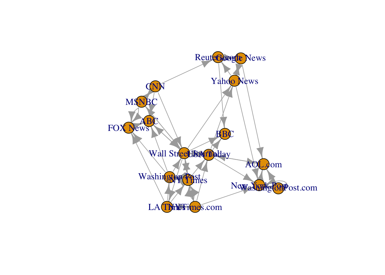
Visualize this graph with
VisNetworkpackage. Hint: use toVisNetworkData.Add an option which allows to select the type of media (Newspaper, TV or Online).
Use different colors for each media.
Use arrows with different widths according to the variable weight. We can also add the option visOptions(highlightNearest = TRUE).
3.3 Dashboard
Dashboards are very important tools in datascience. They allow to gather important messages on datasets and/or a models. We can build dashboard in R with the package flexdashboard. The syntax is based on Rmarkdown, we don’t have to learn new tools. We can find a very nice tutorial on this package at https://rmarkdown.rstudio.com/flexdashboard/. You can use this tutorial to make the following exercise.
Exercise 3.3 (A Dashboard for linear models) We consider the dataset ozone.txt. The goal is to explain the maximum daily ozone concentration (variable maxO3) by the other variables (information about temperatures, nebulosity, wind…). We want to make a dashboard to
- visualize the data : the database and two or three graphs about the output variables (
maxO3); - visualize simple linear models: we choose one input and we obtain the scatterplot and the linear smoother;
- visualize the full linear model: a summary of the models with some graphs about the residuals;
- select the inputs in the linear models;
- …
- As a first step, we propose to write some simple functions for the dashboard.
We only consider numeric variables. Visualize correlations between the variables with the
corrplotfunction of thecorrplotpackage.Draw the histogram of
maxO3with ggplot, rAmCharts and plotly (use ggplotly).Fit the linear model with output
maxO3(all the other variables as input). Calculate the Studentized residuals (rstudent) and visualize these residuals in term ofmaxO3. You can also add a linear smoother on the graph.
- We can now start the dashboard. Use File -> Rmarkdown -> From Template -> Flex Dashboard dialog to open a script.
Build a first dashboard which allows to visualize
- the dataset on a column (use datatable function from DT package) ;
- the histogram of
maxO3and the correlation matrix on a second column.
Add a second tab to visualize the summary of the full linear model. You can use datatable function of
DTpackage. Hint: a new tab could be added withAdd another tab to visualize a simple linear model with one input of your choice. You can print in this tab both the summary of the model and the scatter plot with the linear smoother.
Taking things further: add a last tab where the user can select an input for the linear model. Hint: use the following Shiny commands:
- Input choice
radioButtons("variable1", label="Choisir la variable explicative", choices=names(df)[-1], selected=list("T9"))- Interactive summary
mod1 <- reactive({ XX <- paste(input$variable1,collapse="+") form <- paste("maxO3~",XX,sep="") %>% formula() lm(form,data=df) }) #Df corresponds to the dataset renderDataTable({ mod.sum1 <- summary(mod1())$coefficients %>% round(3) %>% as.data.frame() DT::datatable(mod.sum1,options = list(dom = 't')) })- Interactive graph
renderPlotly({
  (ggplot(df)+aes(x=!!as.name(input$variable1),y=maxO3)+
     geom_point()+geom_smooth(method="lm")) %>% ggplotly()
})
Don’t forget to add
runtime: shinyin the header.
The final dashboard may look like
It is available at https://lrouviere.shinyapps.io/dashboard/.